PROFILE / OVERVIEW
Agent traces are difficult to explain outside engineering.
The marketing site needs to turn a technical workflow into a sequence a buyer can follow.
A client identity and digital experience study for Auvetrace. One visual rule carries the story from a product explanation to the steps a team would review.
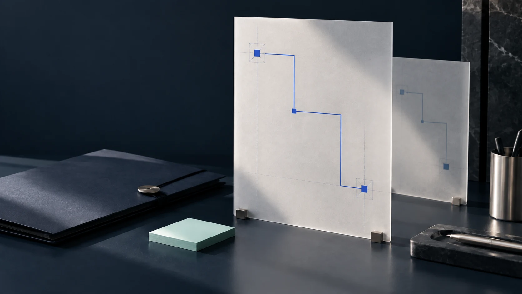
The Auvetrace brief centers on oversight for teams that deploy AI agents. Its intended buyer needs to understand what an agent did, which step needs review and what the team should do next. This study designs an identity around that task.
The client brief defines three jobs for the identity and applications.
The marketing site needs to turn a technical workflow into a sequence a buyer can follow.
The product concept needs a visible connection between action, evidence and a review decision.
The identity must remain recognisable in an app icon, product UI, campaign tile and physical material.
A single angular route connects prompt, action, evidence and review. Square checkpoints identify the places where a team needs to look closer.
The route is used as a symbol and as a layout device. The square checkpoint stays the same shape in the mark, digital screens and printed applications. Type and colour keep the technical subject direct and readable.
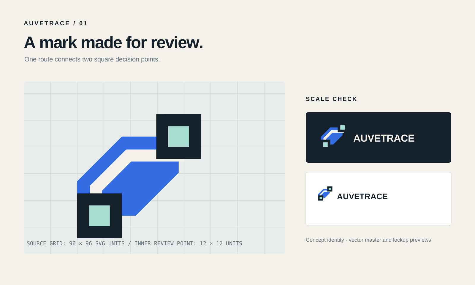
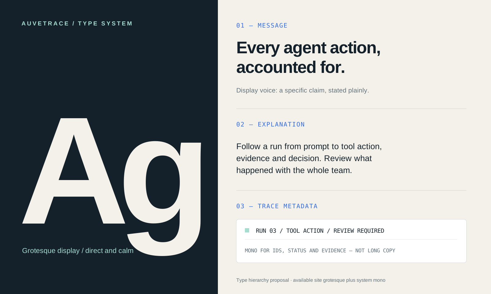
The logo has an explicit exclusion zone and the type system is shown in its actual face. These boards use the 3266 × 1952 presentation ratio of the identity references.
CLEAR SPACE: 12 SOURCE UNITS BEYOND EACH EDGE OF THE 96 UNIT ARTBOARD. KEEP TEXT AND OTHER GRAPHICS OUTSIDE THE DASHED OUTER BOX.
HEADLINE: EVERY AGENT ACTION, ACCOUNTED FOR.
SUPPORTING DATA: CONSOLAS MONOSPACED LABELS.
The exclusion rule is defined from the SVG’s 96-unit artboard. The size row shows the mark at the displayed scales.
The route stands for a reviewable sequence. Ink establishes focus, chalk gives content room to breathe, blue carries action and mint marks checkpoints. These rules guide the identity across applications.
Full-color mark on ink, chalk and mint. White single-color mark on blue. Preserve the 12-unit clear-space rule around every lockup.
Suggested overall balance across layouts. Mint is a checkpoint accent; blue carries links and calls to action. Adjust per application while keeping contrast readable.
The website puts the buyer problem first, then shows the four stages of an agent run.
Follow a run from prompt through tool action, evidence and decision. Give engineering and product teams one shared review path.
Explore sample run ↗The sample run pauses when its reply has no verified citation.
AUVETRACE / DESKTOP WEBSITE
The mobile view uses the same headline, four-stage model and demo request as the desktop concept, with the reading order adjusted for a narrow screen.
A buyer sees the offer, the review path and the intended next step without needing a desktop layout.
Follow a run from prompt through tool action, evidence and decision.
Explore sample run ↗AUVETRACE / MOBILE WEBSITE
The product views repeat the identity rule as an actual information structure. Sample states make the decision visible without inventing product usage statistics.
Support-agent run · example sequence
A cited policy article is missing from the draft reply.
Confirm a source before the response is released.
Sample support-agent run
AUVETRACE / PRODUCT EXPERIENCE
The app icon carries the full path. A social profile mockup presents the offer in plain language and gives campaign content a repeatable place to start.
SOCIAL PROFILE AND POST ARE DESIGN MOCKUPS; NO ACCOUNT, AUDIENCE OR ENDORSEMENT IS REPRESENTED.
A launcher view checks distinction, shape and contrast among neighboring icons. It is a generic phone concept; no device maker, operating system or published app is implied.
The chalk tile gives the blue route and mint checkpoints a consistent silhouette in a dense launcher. The icon is also used in the profile and product navigation views above.
AUVETRACE / APP ICON IN CONTEXT
Three poster concepts carry the same route and checkpoints. Each asks for a product demonstration, while changing the emphasis from visibility to review to action.
CAMPAIGN CREATIVE CONCEPT / NO PLACEMENTS, SPEND OR PERFORMANCE RESULTS ARE CLAIMED.
The same promise becomes an email header and a compact display placement. Both retain the mark, route language and demo intent.
AUVETRACE / CAMPAIGN CREATIVE
The route stays legible across a printed report, event wall and badge. These applications carry the same mark, palette and typography into physical contexts.
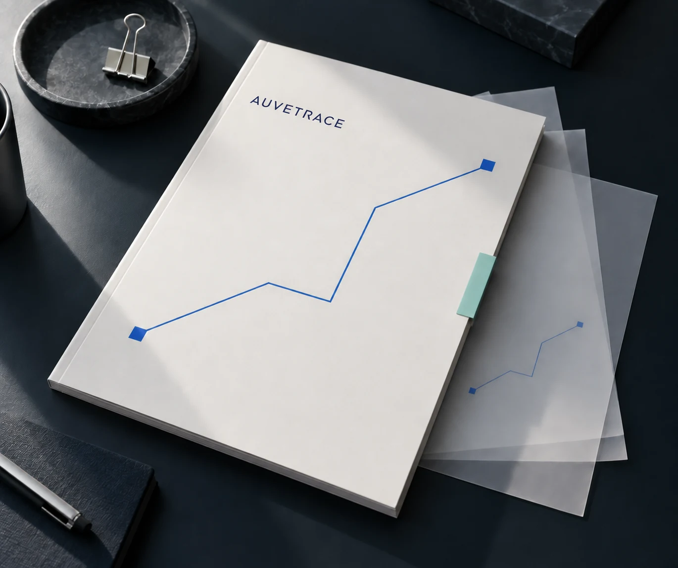
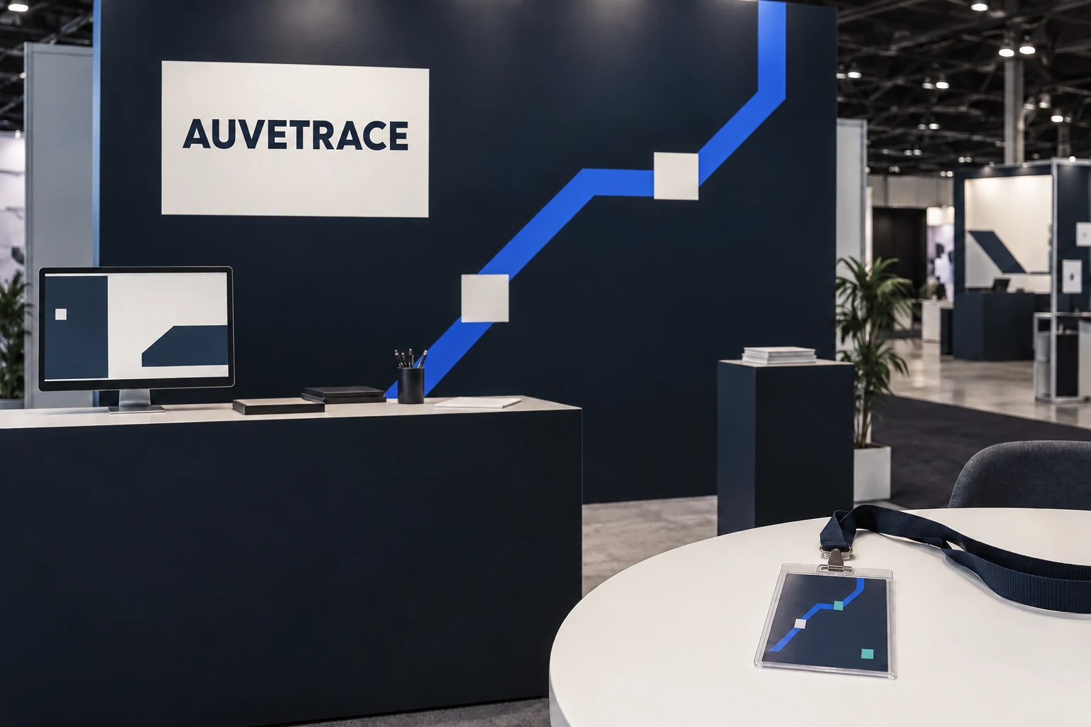
The work connects a technical offer to a consistent identity and a buyer-facing demonstration path. It is a client brand study. Product adoption and commercial results have not been provided for this case study.